
A great business report starts with a solid game plan long before you start writing. We see the process in five key phases: defining your mission, outlining a clear structure, writing with purpose, bringing data to life with visuals, and editing mercilessly. Get this foundation right, and you're not just creating a document—you're building a case that persuades and drives real-world action.
Defining Your Report's Purpose and Audience

Before a single word hits the page, you need to nail down your report's "why" and "who." Without a clear purpose and a specific audience in mind, your report is just a collection of facts. A truly strategic report, however, becomes a powerful tool that guides decision-making and moves the needle.
This initial planning isn't just administrative box-ticking; it's the blueprint for your entire report. This phase guides every choice you'll make, from the data you highlight to the tone you strike. Skipping this step often leads to an unfocused report that completely misses the mark.
Pinpoint Your Core Objective
What is the one thing you need this report to accomplish? Are you informing, persuading, recommending a specific action, or simply creating a record? You need to be brutally specific.
For example, a vague goal like "update the team on sales" is not actionable. A much stronger objective is: "Persuade the marketing department to increase the Q4 ad budget by 15% by demonstrating the direct link between ad spend and Q3 lead generation." This clarity provides a sharp focus for your entire document.
A report's success is measured by its ability to drive a specific action or decision. If your reader doesn't know what to do next after reading it, the report has failed.
Understand Your Audience Deeply
Next, think about who will actually read your report. Their background, priorities, and existing knowledge should dictate your content, language, and level of detail.
Here are a few questions we always recommend you ask yourself:
- Who is my primary reader? Are you writing for a C-suite executive, a department head, a technical team, or outside investors?
- How much do they already know? You should cut the jargon for a non-technical audience but provide the granular data that experts expect.
- What is their bottom line? An executive is likely focused on cost and revenue, while an operations manager will care more about process improvements and efficiency.
Knowing your audience is fundamental to effective business communication. It's how you ensure your message doesn't just get delivered but truly resonates and provides value.
The Report Planning Checklist
Use this quick reference table to ask the right questions before you begin writing your business report.
| Planning Element | Key Question to Answer | Why It Matters for Impact |
|---|---|---|
| Purpose (The "Why") | What specific decision or action should this report trigger? | A clear goal ensures every piece of data serves a purpose. |
| Audience (The "Who") | Who is reading this, and what do they care about most? | Tailoring the content ensures it resonates and feels relevant. |
| Key Message (The "What") | What is the single most important takeaway? | This becomes the central theme that holds your report together. |
| Scope (The "How Much") | What information is essential, and what can be left out? | Defining boundaries prevents scope creep and keeps the report focused. |
Today, reporting is about more than just presenting numbers. A recent IIBA report found that 76% of professionals now see business analysis as a core strategic function. This means your reports must offer genuine insights that connect directly to your company's biggest goals. You can find more details in the 2025 Global State of Business Analysis Report.
Building a Clear and Logical Report Structure
Even the most brilliant insights can get lost in a confusing structure. Think of your report's structure as a roadmap for your reader—it should guide them effortlessly from the core problem to your proposed solution.
Without a logical flow, your key messages become part of a dense wall of text. The whole point of a strong structure is to make your argument clear, persuasive, and easy to follow.
The Anatomy of a Powerful Report
The skeleton of a high-impact business report is fairly standard, but each section has a specific job to do. From the big-picture summary at the start to the nitty-gritty details in the back, every part builds on the last. This creates a narrative that makes complex information feel surprisingly simple and compelling.
Most professional reports follow this general framework, which you can adapt as needed:
- Executive Summary: This is the 30,000-foot view. It’s a self-contained snapshot of the purpose, key findings, and main recommendations. A busy executive should be able to read just this section and understand the entire report.
- Introduction: Here, you set the stage. State the report's objective, define your scope, and give the reader any background information they need.
- Methodology (Optional but Recommended): In short, how did you get your information? Briefly explain if you used surveys, interviews, or financial modeling. This builds credibility instantly.
- Findings/Body: This is the heart of your report. Present your data and analysis in a logical order, using subheadings to break up topics and guide the reader.
- Conclusion: Now it's time to connect the dots. Summarize the most critical takeaways from your findings without introducing any new information.
- Recommendations: Based on your conclusions, lay out the specific actions that need to be taken. Make them clear, practical, and directly tied to the evidence you’ve presented.
- Appendices: This is the place for raw data sets, full survey questionnaires, or lengthy charts that would clutter the main report.
Crafting a Compelling Executive Summary
Let's be honest: the executive summary is often the only part a busy stakeholder will read thoroughly. It has to be powerful enough to stand on its own, acting as a miniature version of the entire report.
Your mission is to boil down the entire story—problem, analysis, solution—into a few punchy paragraphs. It needs to be direct, crystal clear, and persuasive from the very first sentence.
A great executive summary can make or break your report. To really master this, it's worth learning how to write executive summaries that win deals from people who do it every day.
Presenting Findings with Absolute Clarity
When you get to the body of the report, organize your findings thematically, not chronologically. Group related points under clear, descriptive subheadings to tell a coherent story.
For example, a report on declining customer satisfaction could be structured with sections like "Key Issues from Customer Feedback," "Direct Impact on Renewal Rates," and "Competitive Landscape Analysis." This immediately tells a clearer story than a simple timeline of complaints.
The style you choose is also critical. Understanding the difference between a direct explanation and a compelling narrative, which we cover in our guide on expository vs. narrative writing, helps you present facts in the most effective way possible.
If you used an AI writing tool to help generate your report, the structure might look logical on the surface but feel robotic. That's where a tool like PureWrite comes in. We can help you smooth out those transitions and ensure the entire report reads with the natural flow of a human expert.
Visualizing Data to Tell a Compelling Story
Numbers are the foundation of any solid business report, but a spreadsheet packed with raw data rarely wins anyone over. Real impact comes when you translate those numbers into a visual story. It's the difference between telling someone your findings and truly showing them what you mean.
When done right, a good chart or graph makes complex information instantly understandable. It turns abstract statistics into concrete proof that backs up your conclusions and gives your recommendations serious weight.
So, how do you pick the right visual? Here’s a handy decision tree to guide you, based on whether your report is more strategic or operational in nature.
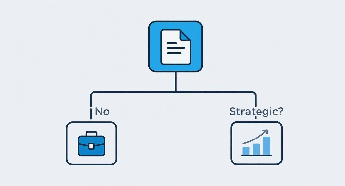
Think of this as your starting point for deciding between high-level visuals for the big picture and more granular ones for day-to-day details.
Matching the Chart to the Story
The golden rule of data visualization is to pick the right tool for the job. Every chart type tells a different kind of story, and using the wrong one can obscure your message entirely.
Here are a few common use cases and their ideal charts:
- Comparing values across different groups? A classic bar chart is your go-to. It’s perfect for showing sales figures across product lines or comparing marketing campaign performance.
- Tracking changes over a period of time? Nothing beats a line graph. Use it to illustrate monthly website traffic, quarterly revenue growth, or customer churn rates year-over-year.
- Breaking down a whole into its parts? A pie chart or a stacked bar chart works well. Think market share percentages, budget allocations, or the demographic makeup of your customer base.
Clarity is always the end goal. If a chart makes your data more confusing, it has failed its purpose.
Design Principles for Clean Graphics
Once you’ve picked your chart, the design is everything. A cluttered, hard-to-read graphic is just as bad as a wall of text. Your goal is to create something clean, simple, and professional that lets the data speak for itself.
The purpose of a great visual is to remove the noise and highlight the signal. Every element on your chart—every line, label, and color—should serve a purpose. If it doesn't add clarity, it's a distraction.
Here’s how to keep your visuals looking sharp and professional:
- Keep the color palette simple. Stick to two or three complementary colors. Use a single, contrasting accent color to draw the eye to the most important data point.
- Label clearly but briefly. Ensure your axes and data points are labeled, but cut any long, wordy descriptions that make the visual feel cramped.
- Ditch the clutter. Get rid of 3D effects, heavy gridlines, and any unnecessary decorations. A clean, flat design almost always looks more modern and is easier to understand.
For reports heavy on data, interactive visuals can be a game-changer. You can take your skills to the next level and learn how to build amazing reports using Excel dashboards, which allow your audience to explore the data for themselves.
Writing with Clarity and Professional Authority
https://www.youtube.com/embed/65U5byDZ55M
Your writing style is the engine that drives your report's credibility. Even the most brilliant data can get lost in clumsy sentences or confusing corporate jargon. To make your work stick, you need a professional yet approachable tone that builds trust and ensures your message is both heard and respected.
This is about more than just good grammar. It's about building arguments that feel solid and presenting recommendations that seem not just smart, but completely achievable. When you write with genuine clarity, you create a document that commands attention.
Ditch the Passive Voice
One of the quickest ways to sound more authoritative is to use the active voice. It makes your writing direct, punchy, and far more engaging. Instead of saying, "The market share was increased by the sales team," write: "The sales team increased market share."
This simple switch puts the doer of the action front and center, making your statements feel more powerful. It’s especially critical when outlining recommendations or assigning tasks, where ambiguity is the enemy.
Cut Through the Jargon
Every industry has its own language, but a great report should make sense to a broad audience, including stakeholders outside your department. Before using an acronym or a highly technical term, ask yourself if a simpler word would work just as well.
If a specific term is absolutely necessary, just take a moment to define it the first time you use it. Your goal is to communicate, not to show off your vocabulary. An accessible report is always more effective.
Polishing your writing and sticking to the fundamentals is a big part of that. For a quick refresher, check out our guide on basic grammar rules that can instantly sharpen your report's professional edge.
Ground Every Argument in Evidence
Real authority comes from building a rock-solid case with good evidence. Every conclusion you draw and every recommendation you make must be directly connected to the data you've presented.
Use transitional phrases that bridge the gap between your findings and your interpretations:
- "Based on the Q3 sales data..."
- "This trend strongly suggests that..."
- "As a result, our recommendation is to..."
This technique transforms your report from a collection of facts into a persuasive, evidence-based argument. It shows the reader that your recommendations are the logical next step derived from careful analysis, not just opinions.
According to a recent outlook survey, 74% of executives expect revenue growth, meaning they are hungry for reports that guide smart strategic decisions. As companies shift from caution to growth, your reports become vital tools. You can read more about these business leader insights.
If you’ve used an AI writer to draft your report, the tone might feel a little robotic. At PureWrite, we specialize in refining that AI-generated text to ensure your authentic voice comes through—clear, confident, and professional. Try PureWrite today and see how we can make your business reports truly connect.
Refining Your Draft with a Critical Eye

You’ve poured hours into research, analysis, and writing. The last thing you want is for a simple typo or a clumsy sentence to derail all your hard work. This final review is where a good report becomes a great one, showing your audience that you value their time and attention to detail.
This final polish cements your report's authority. It's a crucial part of learning how to write business reports that actually get results.
Moving Beyond Spell Check
While automated grammar and spell-check tools are a fantastic first line of defense, they are far from foolproof. They will miss a correctly spelled word used in the wrong context (like "affect" vs. "effect") and won't tell you if a sentence is just plain awkward.
Your critical eye is the most powerful editing tool you have. You're not just hunting for errors; you're looking for ways to sharpen your message and improve the overall flow.
One of the best editing tricks is to simply step away. Give yourself a few hours, or even a full day. When you come back to the draft with fresh eyes, you’ll be amazed at the mistakes and clunky phrases you missed before.
A Practical Editing Checklist
To avoid feeling overwhelmed, we recommend reviewing your draft in multiple passes, each time focusing on a different set of issues.
- Clarity and Conciseness: Is every sentence as direct as possible? Hunt down and remove redundant words, filler phrases, and unnecessary corporate jargon.
- Consistency: Scan the document for consistent formatting. Are all your headings the same style? Is the spacing uniform? Ensure your tone of voice is consistent from start to finish.
- Accuracy: This one is non-negotiable. Meticulously double-check every single number, date, name, and statistic. One glaring error can cast doubt on your entire report's credibility.
- Flow and Transitions: Try reading your report out loud. It might feel a little strange, but it's an incredible way to catch sentences that stumble or transitions between sections that feel abrupt.
Humanizing Your Final Draft
If you used an AI assistant to get your first draft on the page, this editing stage becomes even more vital. AI is great for speed and brainstorming, but its output often sounds robotic, generic, and lacks a natural rhythm.
In fact, while over 90% of content creators now use AI to accelerate their workflow, it’s that final human touch that makes the content resonate. Polishing AI-generated text is a skill, and we have a whole guide on how to rewrite AI text to human with practical techniques.
This is exactly where we come in. At PureWrite, our platform specializes in taking AI drafts and refining them to sound authentic and genuinely authoritative. If you want to transform your draft into a polished report that truly reflects your expertise, Try PureWrite for free.
Common Questions on Writing Business Reports
Even the most seasoned writers have questions. Here are some of the most common ones we hear, along with clear, practical answers.
How Long Should a Business Report Be?
The honest answer is: it depends. A quick weekly sales update for your team might be a single page, while a formal annual report for the board could easily run past 50 pages.
The golden rule is not about page count; it's about being as concise as possible while delivering all necessary information. If you can make your case in five pages, great. If it takes twenty, so be it.
When in doubt, just ask. Checking with the person who requested the report about their expectations for length and detail can save you a lot of guesswork.
What Is the Most Important Section of a Business Report?
If we had to pick one, it would be the Executive Summary. Hands down.
Why? Because many of the busiest people on your distribution list—executives, department heads, key decision-makers—will only read this section. It has to stand on its own and give them the complete picture: the core findings, your conclusions, and what you recommend they do next.
A killer executive summary ensures your main message gets through, even if the rest of your beautifully written report only gets a quick scan. It's your single best chance to communicate the report's value.
How Do I Handle Confidential Information?
When dealing with sensitive data, you must be meticulous. First, know exactly who is authorized to see the report and keep the distribution list tight.
Every page should be clearly marked with a simple, bold footer like "Confidential" or "For Internal Use Only."
In the body of the report, stick to the facts and steer clear of speculation. A great way to protect sensitive details is to use aggregated or anonymized data whenever possible. This lets you show trends without exposing private customer information or trade secrets. Most importantly, always follow your company's data security and privacy policies to the letter.
Can I Use AI to Help Write My Report?
Yes, but you must be smart and ethical about it. AI tools are fantastic for kickstarting the process, helping you brainstorm ideas, create a solid outline, or even draft initial sections. This can be a huge time-saver.
However, you should never treat AI output as the final word. The text it generates often sounds generic and misses the specific context and expert voice a professional report needs. It’s a starting point, not the finished product.
You also need to be aware that many companies and universities use AI detectors. It's a good idea to understand how platforms like Turnitin detect AI to ensure your work maintains its authenticity. The final, critical polish must always come from you.
At PureWrite, we’re experts at adding that essential human touch. Our platform is designed to take that clunky first draft from an AI and help you refine it into clear, professional writing that sounds like you. Make sure your report has the impact of real human expertise by trying PureWrite today.
Ready when you are.
Paste your draft, get writing that reads as yours.
No card required.